[Game Design] Enemies Design - What I learned



Hi everyone, welcome to this design talk!
I'll discuss how I create my enemies regarding the design and how they can make your game mechanics shine.
It is the first time I have written a post in that style, I hope it'll be helpful!
Ok so, where do we start?
Enemies are everywhere in video games. Most games, to be precise. It always has been a fascinating challenge. We're all searching for a worthy fight or a little bit of action. In fact, enemies make a game less boring. At any moment, a fight can start and you suddenly are under pressure. It's now a question of time before you or your opponents lose the fight.
All of this brings us to the first rule for an enemy: Don't be boring.
A boring enemy is a boring fight, a boring fight is 5 minutes of boredom if not more. 5 minutes of boredom might be enough for your players to just quit your game. This raises the next question, how do you make your enemies not boring? Here starts the difficulties of designing enemies.

What makes an enemy entertaining?
There are many ways to entertain players in a game. You can entertain them with exploration, combat, story, etc. In a fight, it's the same thing. Of course, fighting directly against the enemy might be entertaining, but it's not enough. Your enemy must have a recognizable shape, to be memorable and catch players' attention. It needs to be different than other enemies we saw before in your game. Is it stronger? It is bigger? Does the enemy have a unique ability? Can it jump? Another aspect that is fundamental is balancing. A well-designed enemy is boring if unbalanced, whatever you do. Don't make your enemies piles of statistics, especially for certain genres. Instead, iterate on your enemy's balance.
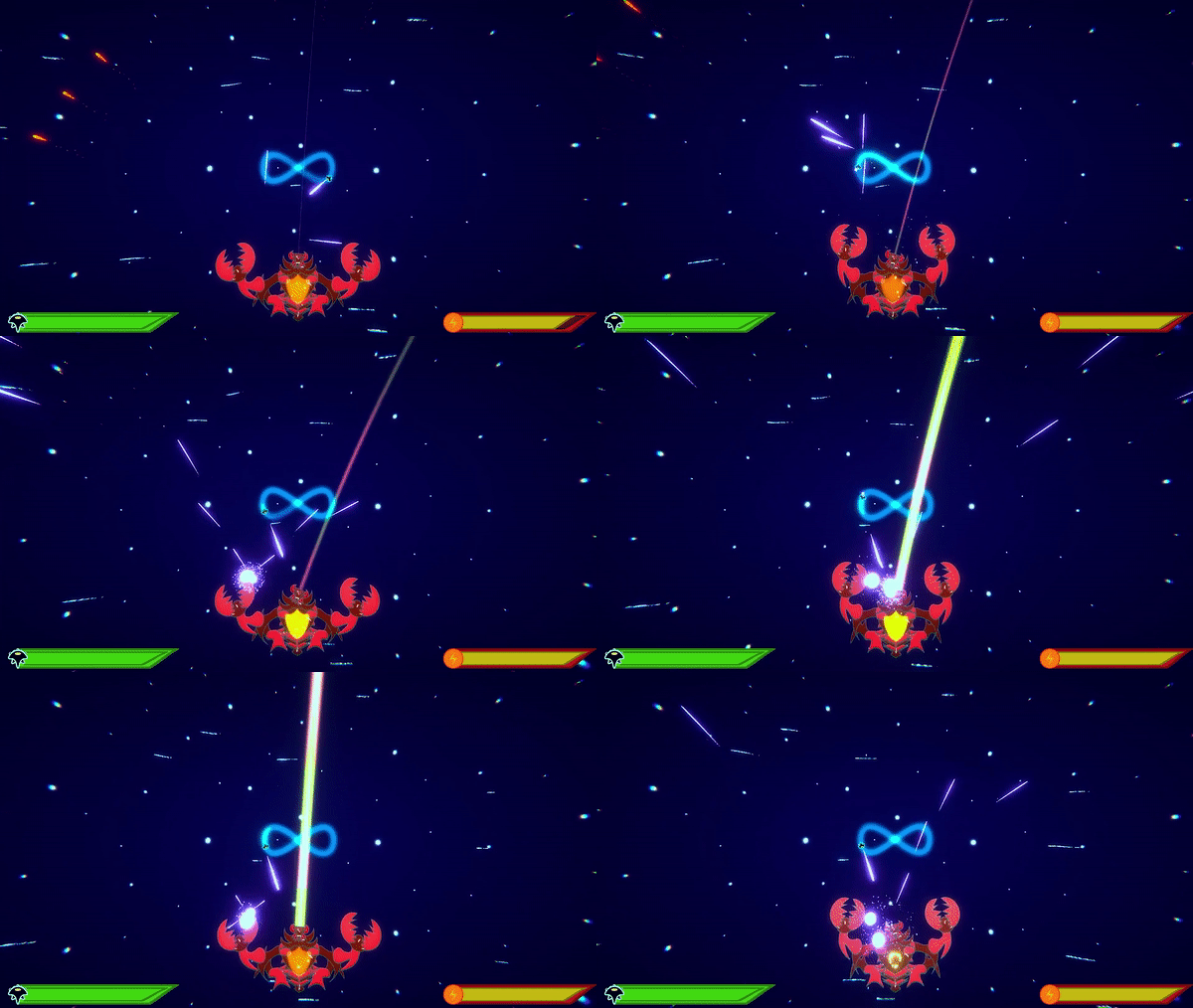
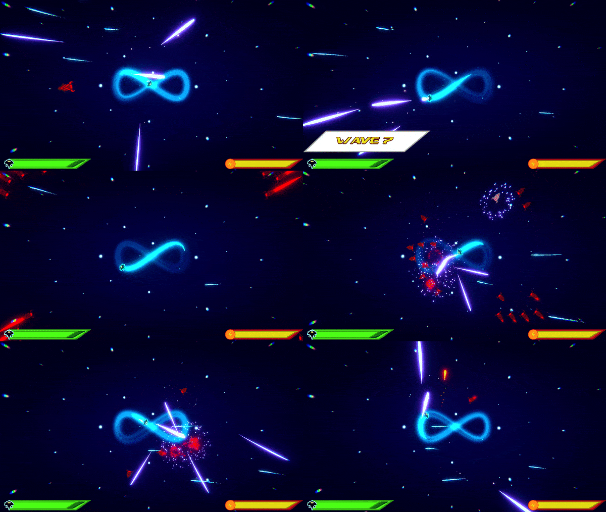
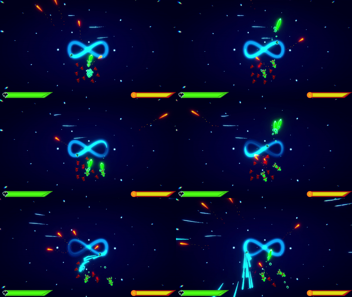
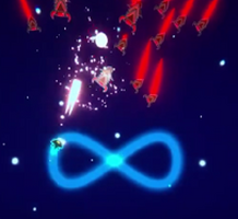
I'll use my game Infinity Overwhelm as an example. The game was initially created for a game jam. Enemies were basic, and I thought they were useless, while my bosses were good.
I would've been shocked to realize I was absolutely wrong. My basic enemies were the best part of it, even if they were not perfect.
The bosses were mostly bigger enemies with a lot more health. A boss fight could be summarized as shooting in the same direction for 2 minutes and sometimes avoiding a bullet. This is boring. This is why I added many abilities to my bosses later on. But we'll see that later.
Another principle we can understand from my example is that, 95% of the time, it is better to fight multiple, weak enemies, rather than one or more resistant ones. This is even more true for games like shoot'em up. While fighting a pile of statistics is boring, fighting multiple weak enemies is fun. Many things are happening on screen, we are under pressure and need to think well about what we need to do.

Got it? Let's summarize our first principles for good enemies:
- A good enemy is not boring.
- A good enemy is memorable.
- A good enemy needs to catch the attention.
- A good enemy is well-balanced.
- Enemies are not piles of statistics.
Now starts the design process
Right, we now have an idea of what we need to do, but not how to do it. The problem is that there are thousands if not millions of ways to make an enemy. I'll use my game as an example, but keep in mind that it is not the only way, and it isn't flawless. Try it, and if it doesn't work, find another way to do it.
That said, I want to add another principle right before starting. It's an answer to the other principles: A good enemy challenges the player.
If you make a flying enemy in a game where players cannot reach them, they are not really challenged about their fighting skills and can't interact with your enemy. This makes the interaction boring if not inexistent. It is mostly the principle that we'll try to address, as it summarizes well the other ones).

How to challenge players: Horizontal and Vertical design
One great way for an enemy to challenge the player is to require them to use one of their ability to answer it. Ideally, it must force them to interact with your enemy in a different way that they interact with other ones. Let's say it's a sword fight. The basic attack is efficient against all your enemies. If you add a flying enemy that requires the player to use a secondary ability that can reach flying enemies, you add a new layer of interaction to the game. This joins the principle we saw earlier of players needing to act not mechanically. They must think about what ability is the best one to use in this situation and not just use the same one they always use. This is called horizontal design.
This first idea to challenge the player is good but doesn't always work, else you would end up with one different ability for each enemy in your game. This brings us to a second way: vertical design. Vertical design is all about stronger enemies. We noticed earlier that making enemies piles of statistics wasn't a good way to make them entertaining, so why are we talking about this?
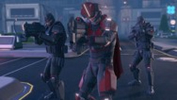
First, vertical design isn't actually bad. It is limited. Take XCOM 2 as an example: the first ADVENT unit you fight is new for you. Later in the game comes a new version of this enemy, which is just stronger. It is the same enemy, better and reskinned. But it still feels somehow new while familiar. Even later, you'll find another stronger version that completely obliterates the existence of previous versions. Verticality in design is a nice way to keep players interested in the game without reinventing your enemies from scratch. If you are curious, you'll find that many games do this. You need to be careful though. Vertical design is more limited, as it's about difficulty more than complexity. It can easily ruin your balancing and feel like a lazy design. It's a very risky technique.
Secondly, vertical design doesn't always mean more health or damage. It can be anything: an enemy moves faster, shoots more bullets, is harder to hit, and has a higher shooting range. Be sure to emphasize what makes your enemy interesting. This is peak vertical design and what makes it a valid option along with horizontal design. By the way, vertical design can also go downward. You can do a weaker enemy if needed.

Combine!
You know what? Those two methods aren't exclusive! You can make an enemy more difficult, and more complex! It's again a method that you must not abuse, but it works. Usually, I come up with bosses that reuse mechanics from enemies. It's technically vertical + horizontal, but here's another example for Infinity Overwhelm: the third enemy in the game is a stronger version of the first one. It is bigger and shoots a stronger bullet. It is also a more complex version of it, as it uses a shield as well as the abilities of the basic enemy.
For a more advanced understanding of verticality and horizontal, you can think of a basic enemy type, that would serve as a base for all other enemies. Horizontal designs would add mechanics to your enemy while vertical designs would change the statistics. Remember that it is a tree and not a straight line. An enemy can derive from several enemies.
As long as you feel like a specific idea is challenging for the player, try to think of whether you should focus on horizontal or vertical design.

Enemies make the progression
In a game with a lot of enemies, they are a vector of progression. Each new enemy is a significant message for the player: you reached a new part of the game. The game will be different from now on.
This is why your enemies must be different, they notify players that the game still has surprises for them. Discovering a new enemy is a feeling that makes players so happy that you can catch their attention for a certain time before they get used to this new enemy. And more than just adding this new enemy to your level design, you can mix it with previous ones, add multiple copies of it, etc.
Enemies make an old mechanic feel like it's new
Vertical design doesn't mean pure numbers. It can be used for mechanics. It's not the easiest thing to do but it works well and can save you some production time.
As an example, Koopas in Super Mario games uses the same mechanics as Goombas. Still, they feel very different. What's a Koopa besides a Goomba with a shell?
Don't forget this rule, it can help you a lot. Vertical and Horizontal design are such powerful tools.
Bosses serve a purpose, enemies serve bosses
Ok now let's talk about the big boys. Each enemy you design, must prepare you to fight a boss. See, a boss can be anything. In Ori games, the chases can be considered as bosses. Still, the game prepared you for them during the previous levels. In a game where enemies are everywhere, it's the same thing. If your enemies in a level are enemies that are fast and not precise, your boss must emphasize those mechanics.
More than that, a final boss must challenge all the basic mechanics you taught to your players during the game.
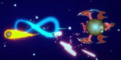
I want to take another example from Infinity Overwhelm: Asteroid Turtle. This boss comes right after the level that introduces you to enemies with shields. This is why the boss uses a shield while performing some attacks. It is a test to check that players understand that they must not attack when the boss uses a shield but avoid the attacks instead.

What should I do for my first boss, then?
Nice question. It deserves a nice answer. It took me some time to realize it, but as I said earlier, enemies serve bosses. If your first enemies are basic enemies that challenge basic character mechanics, then, why would your first boss not do the same? Your first boss will act as a checkmark to ensure that your players know how to control your character.
In most good games, it's usually how it works. This doesn't mean that your first boss must be basic. You need to make it not boring while challenging basic abilities at the same time. It's actually pretty hard to design a first boss. I would recommend that you document yourself about tutorials. It's a topic that is still blurry, with open questions and various applications. It would deserve a whole post and wouldn't even be talked about in its entirety.
Few enemies are enough
This post might feel like you must design a lot of enemies. Actually not. Great games have as many different enemies as needed. It's a question of progression. It depends on many factors that I can't enumerate. Might only advice is that if you design an enemy with no specific intention for your progression, maybe you are going in the wrong direction.
You know the rules
As this post is clearly becoming too long, here's a list that summarizes all the rules we've seen. Use it as much as you need, and don't hesitate to add yours if you feel like a rule is lacking, especially for some specific genres.
- A good enemy is not boring.
- A good enemy is memorable.
- A good enemy needs to catch the attention.
- A good enemy is well-balanced.
- Enemies are not piles of statistics.
- A good enemy challenges an ability from players.
- Horizontal design makes your enemies more complex.
- Vertical design makes your enemies more difficult.
- Vertical and Horizontal designs can be mixed together!
- Enemies make players feel their progression.
- Old mechanics are cool, reusing them is cool too!
- A good enemy prepares you to fight a boss.
Other approaches
There are many other ways to design good enemies. It depends a lot on your game. This post was mostly focused on heavy-action genres. It may be wrong for some genres like cinematic platformers or fighting games. For those games, I still recommend to use enemies as progression tools, but you probably should
Already the end
Of course, this is a fairly open approach to enemy design. I feel like it gives enough starting tools for you to get an idea about what you are doing. I can only recommend you explore more in-depth the topic, there's so much to discover!
Remember that this is what I've learned through my different projects, mostly Infinity Overwhelm. It isn't a perfect approach and still has flaws, but I am confident it avoids the biggest mistakes.
Thank you for reading, don't hesitate to ask any questions or check my game Infinity Overwhelm if you have enough time and like shmups.
Have a nice day

Files
Get Infinity Overwhelm
Infinity Overwhelm
Move and shoot in a loop!
| Status | Released |
| Author | Climbing Dolphin |
| Genre | Shooter, Action |
| Tags | 2D, Indie, Sci-fi, Shoot 'Em Up, Singleplayer, Space, Top down shooter |
| Languages | English |
More posts
- Demo Released!Oct 15, 2023

Leave a comment
Log in with itch.io to leave a comment.